
Icons and symbols surround us, digitally and physically, and we give the vast majority of them a vanishingly small amount of attention. By and large we know what they represent and what they mean. A recycle bin on your desktop. A stop sign on the road. They are ubiquitous to the point that we barely actually see them as actual visual images any more, simply a representation of a concept. We all know what a fire exit symbol looks like but could you actually draw one? Maybe, maybe not. Without looking could you describe the DVD-drive icon on your computer? Do you know what the colours each letter is in Google’s logo?
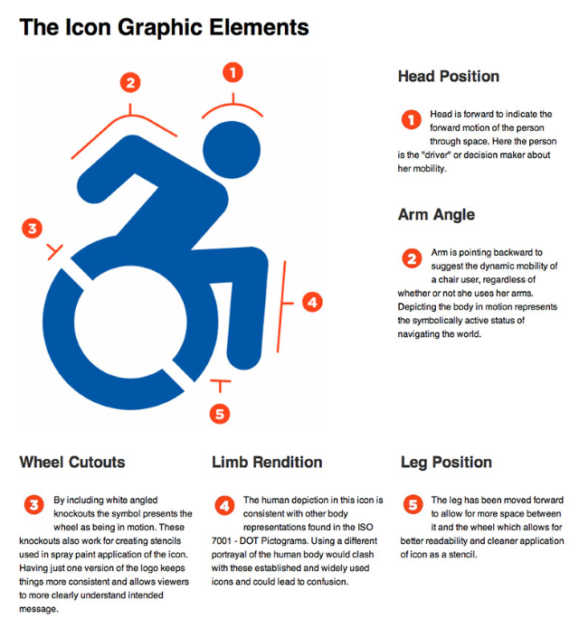
So, icons are everywhere and we barely see them on a conscious level. The argument then that common icons can actually colour our perceptions of what they represent might be met with scepticism. It’s an icon, it means what it means. Not necessarily. The Accessible Icon Project certainly don’t think so. They’ve been redesigning the ‘International Symbol of Access’ – the wheelchair symbol – with the explicit goal of altering people’s perception of it and those it represents.
The current standard ‘wheelchair symbol’
I’ll not go into detail on the rationale behind this – it should be fairly obvious that wheelchair users suffer from poor perception in societies across the world – I’m posting this to highlight a more general concept. When you’re designing something, be it a sign or a game HUD, you aren’t just representing a basic idea but colouring that representation too. This calls back to the issues the Desktop Dungeons team had with designing the character portraits for their female classes. Making an image that says “female mage” or “female rogue” is easy. It’s been done literally thousands of times. Making an image that says “female mage that trades on competence not sexuality” is apparently much harder and rarer.
So, designers and graphic artists, here’s an object lesson for you. Have a care when designing symbols. You might get the representation right, but what else might you be communicating?