Category Archives: Meta

Crouching Lemming Hidden Background

Lemmings

More CSS experimentation with the site. Hover over the menu bar up there. Go on, I’ll wait. Whee, Lemming!

The image is a simple animated GIF I put together after a quick Googling. Initially I just wanted to stick the Lemming somewhere unobtrusive on the page, but after a bit of experimenting there’s really nowhere you can put it that doesn’t get a bit distracting and annoying – there’s a reason always-on, auto-playing animations mostly died with Geocities. So I opted to stick it on the menu bar and only appear on mouse over. In itself that’s easy enough – add a “:hover” selector to the menu element and it’s done. But it looks a bit jarring just flicking on and off as you move the mouse around the page so I started looking into having it fade in and out. Since I’ve no idea how to mess with the actual code of a WordPress site or theme it had to be a CSS-only solution.

At first it wasn’t looking hopeful, since it really is the kind of thing people automatically go to Javascript for and with good reason. But eventually I unearthed the fact that Chrome supports transitions on background images. Woo! I did get tripped up by the fact that if you aren’t fading from another image (and one the same size at that) it not only fades but resizes as well. Easy fix, just use another image as the default non-hover background and fade from that.

The code is all below the cut.

Read More →


The great blog migration of June 2014

Migration

After a few weeks of deliberation I’ve moved Pixieland onto a new host. The process was a bit of a journey of discovery, but thanks to Duplicator it was a lot easier than it might have been. After a few failures with unhelpful error messages and a bit of manual bodging it all seems to be up and running again.

Fingers crossed…


Pixieland: Now with actual Pixieland

Off to work we go

Pixieland has a new home! No longer stranded in aburn.org.uk where the poor thing first saw light of day. No! www.pixieland.org.uk is go. Thanks to the magic of a networking wizard (and a hammer, hammers are usually involved I hear) the migration was as seamless as makes no difference and all the old links should redirect transparently. Both woo and indeed yay. Thank you, Mr Networking Wizard.


The machine has spoken: EyeQuant

EyeQuant Banner

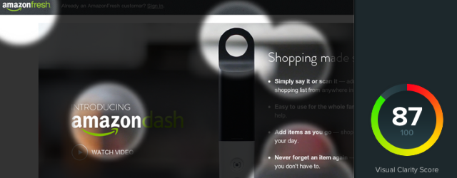
A few days ago I read about EyeQuant in an Ars Techinca article. EyeQuant, a Berlin-based startup, have developed and trained an AI they claim can tell you how clear your website it and what people will pay attention to. The company claim a number of success stories with big-name companies.

They charge a hefty monthly fee but also offer a free demo so I thought I’d give it a whirl.
Read More →


Success! Responsive goodness

Chiron Responsive Banner

Earlier I said I was going to have a crack at making the theme I use for Pixieland a little more responsive and you know what? I actually did it.

Clunky and coarse, yes, but now if the page width drops below the previous minimum of 960px things will get out of the way and let the width drop sanely to the content minimum of 640px. It actually looks kind of OK too, though I’m sure I’ve missed some inevitable side-effects of being a bit over-zealous with the CSS selectors I’ve overridden.
Read More →


Having a poke at responsive web design

Responsive Web Design Banner

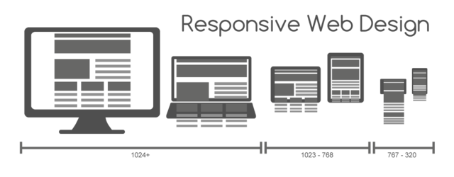
Responsive design. You can’t go anywhere on the internet without tripping over the term. And what a wonderful thing it is. Using modern CSS and Javascript techniques to let the same site reflow its content to fit different window sizes, growing and shrinking, showing and hiding as needed. It makes for some truly slick sites and, perhaps more importantly, reduces the maintenance effort by having less code and design to maintain since you no longer have to have separate sites for different sizes and devices – at least not to the same extent you’re used to.

But how does it work? That’s what I wanted to know, and this article is the fruits of my – admittedly lazy – research. A simple style sheet for a bare-bones responsive page.
Read More →


The Macro Game

So it finally happened. Today sees the birth of my second son, Theo. While we deal with the joys and trials of parenthood+ I’m probably going to be seriously neglecting this blog for a while. I’ve got a healthy buffer of soundtrack posts built up and there are some things in the near future I won’t be able to help posting about, but generally speaking, cheerio for now.

And yes, he’s a Friday the 13th baby, born on Voyager’s first day in true interstellar space. An interesting start…


New theme – Chiron

I got a little tired of the brown so switched to the Chiron theme. Of course now I need to go through all my old posts and fix the colours and inevitable layout issues. Please bear with me.

…exciting edit montage…

And done. Hopefully. It also seems to have resolved some layout issues with embedded Youtube videos.


Bandcamp, Bandcamp, Bandcamp…

Sad LlamaBandcamp updated their embedded players, and of course that means the custom styling I’ve been using this far has all fallen apart. Yay! And I was just wondering what to do while my baby naps. Thanks Bandcamp!


WordPress and Android

Ooh, the Android WordPress app is really quite slick.

Upshot the first: more content, possibly.
Upshot the second: autocorrect-inspired gibberish, most certainly.
Read More →